Development of empty state illustrations for foundU
Design Brief
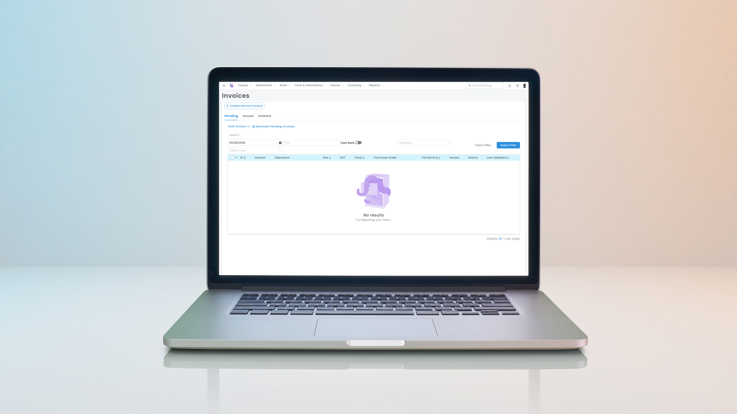
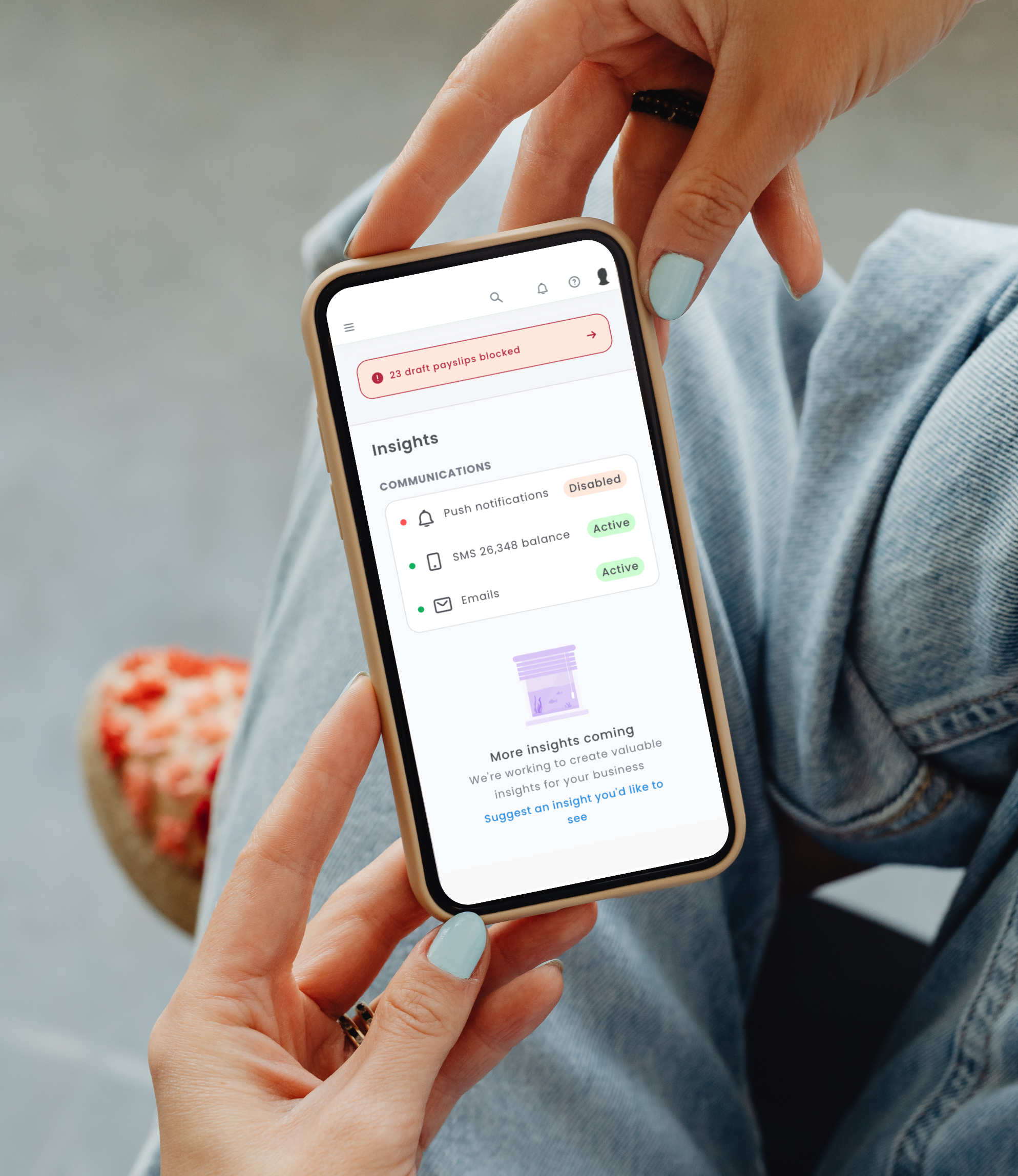
As the Visual Design Manager at foundU, a workforce management platform, I was tasked with creating a series of empty state illustrations to improve the user experience in moments where no data was available. These illustrations aimed to provide users with helpful visual cues - presented in a tone that was friendly, supportive, and aligned with foundU’s brand. The goal was to ease frustration, guide user action, and add personality to otherwise blank or confusing moments in the platform.
Timeframe
Platform
Role
Company
Visual Design Manager
foundU
Desktop and mobile app
6 months

Design Objective
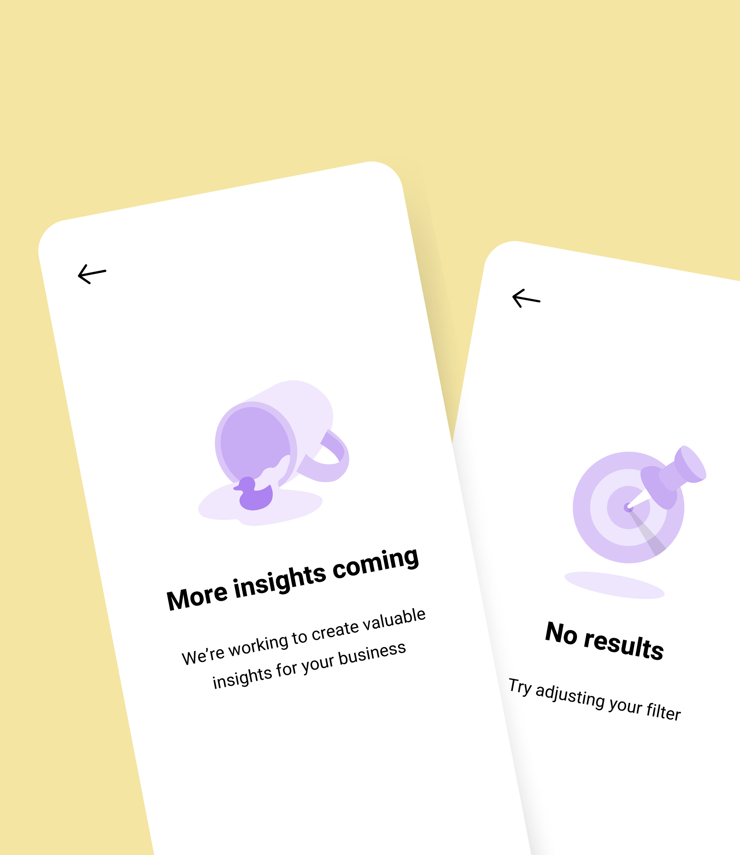
The key objective was to clearly communicate why a section was empty and what users should do next - whether that was uploading data, exploring features, or returning later. Rather than presenting a blank screen, the illustrations offered visual reassurance and direction. They were designed to strike a balance between clarity and charm, professional yet playful, informative yet inviting.
Design Considerations
Playful Visual Language
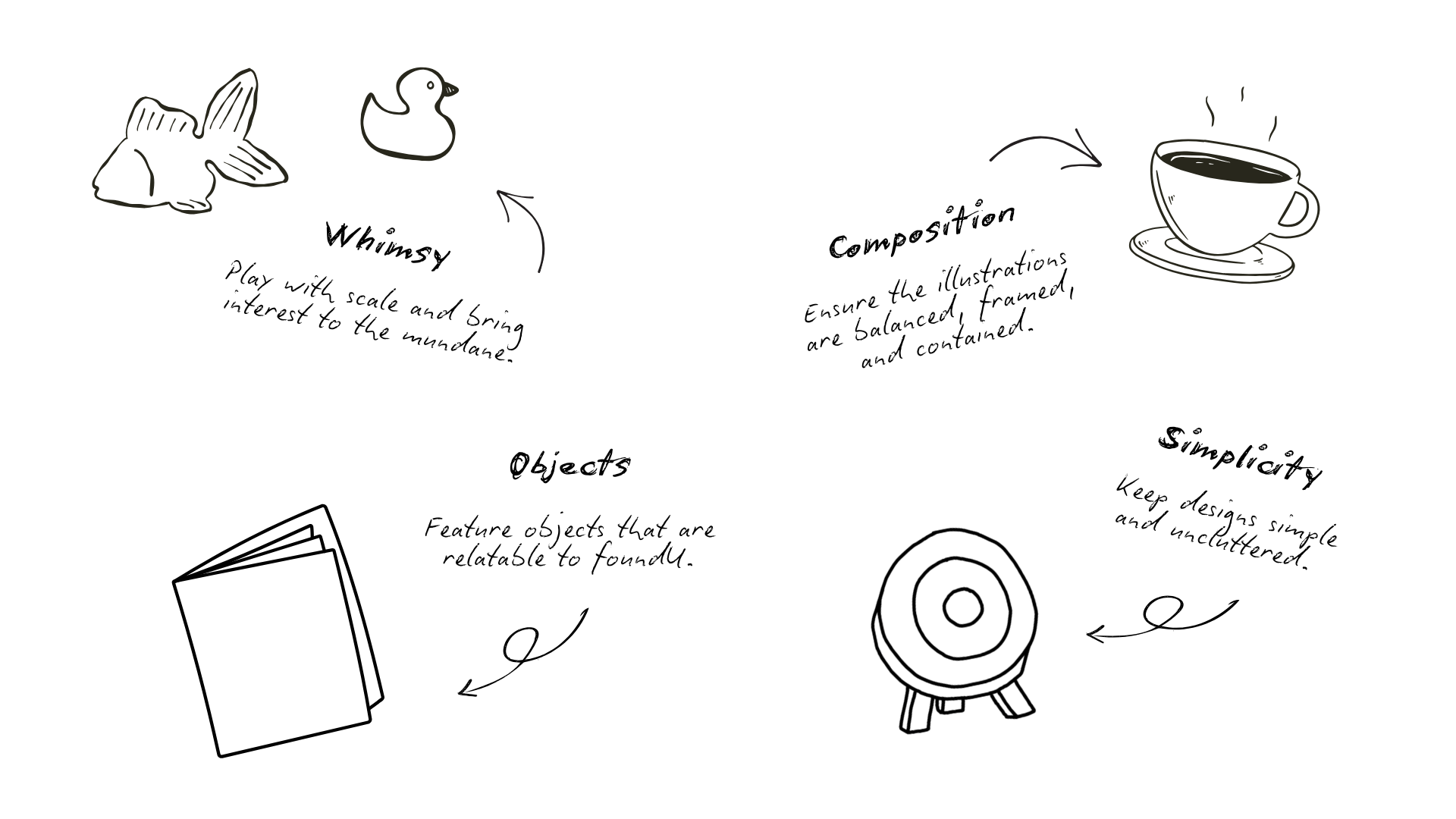
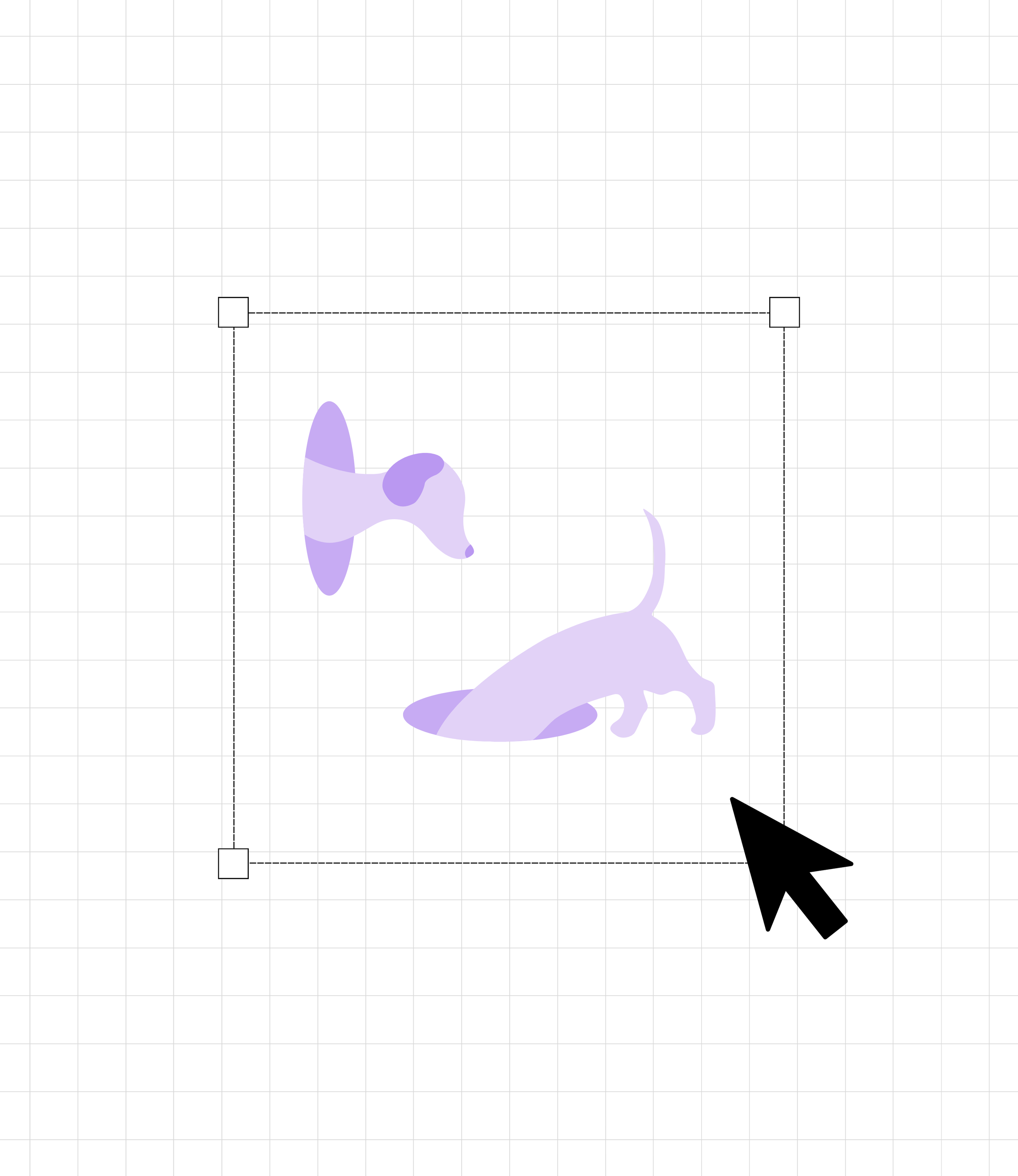
To bring warmth and personality to these interactions, I used whimsical, oversized office objects- like an exaggerated thumbtack or coffee mug. These touches added lightness to the experience, softening what might otherwise feel like an error or dead end.
Familiar, Relatable Elements
I drew on common workplace objects such as filing cabinets, stationery and coffee cups to ground the visuals in everyday experiences familiar to our users. These cues helped make the illustrations feel natural within the context of the platform and reflective of foundU’s modern, flexible work culture.
Simplicity and Focus
Following UI best practices, the illustrations were kept clean and minimal. I avoided overly detailed or decorative elements to ensure the message was clear and the user’s next steps were obvious. This focus on clarity made the illustrations effective, without distracting from their purpose.
Brand Consistency
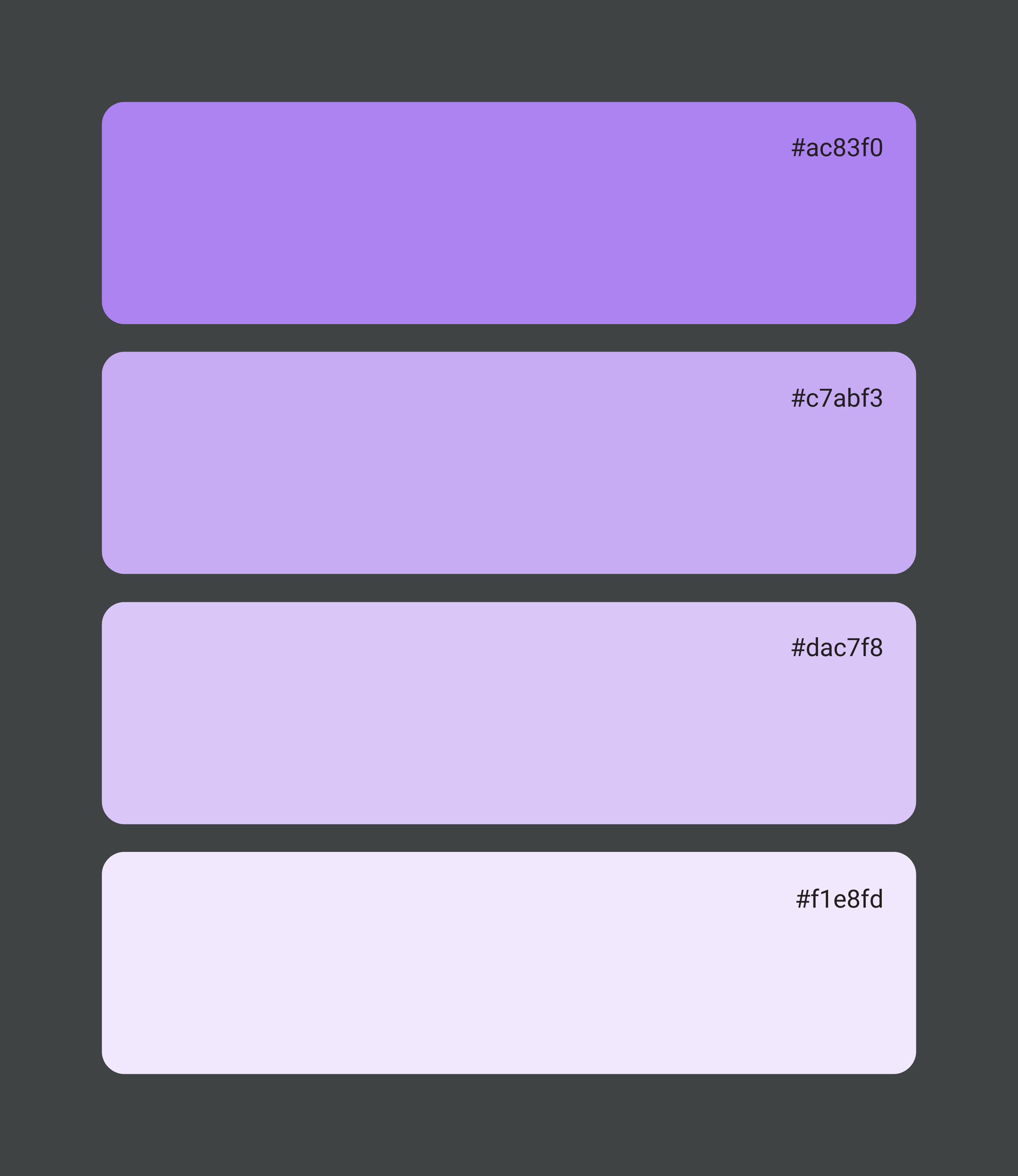
To maintain cohesion across the platform, the illustrations were designed using foundU’s existing brand elements - rounded shapes, defined line weights, and a consistent colour palette. This visual alignment ensured the illustrations felt integrated, not separate from the rest of the interface.
Layout and Composition
Each illustration was carefully composed to fit seamlessly within the UI space. I paid close attention to visual balance, distributing objects evenly, maintaining white space, and avoiding overcrowding, so the illustrations enhanced the interface without dominating it.
Impact & Results
The final illustrations improved the user experience by turning blank states into informative, engaging moments. Users now receive visual guidance on what to do next, helping reduce confusion and encourage continued interaction.
The illustrations also reinforced foundU’s friendly, approachable brand identity, while their thoughtful design ensured they complemented the platform without being intrusive. This small UX enhancement had a meaningful impact on user satisfaction and usability.
Conclusion
By transforming empty states into moments of clarity and connection, this illustration series helped users feel more supported and confident within the platform. The blend of playfulness, simplicity, and brand alignment made the visuals both functional and delightful - enhancing the experience and reflecting foundU’s user-first approach to design.