
Building a Cohesive Visual Identity for foundU

Overview
When I joined foundU as the Visual Design Manager, the company had just rebranded, but the identity was inconsistent and didn’t fully represent the brand’s services. My goal was to refine and expand the visual identity, ensuring it clearly communicated foundU’s mission as a modern workforce management platform.

Approach
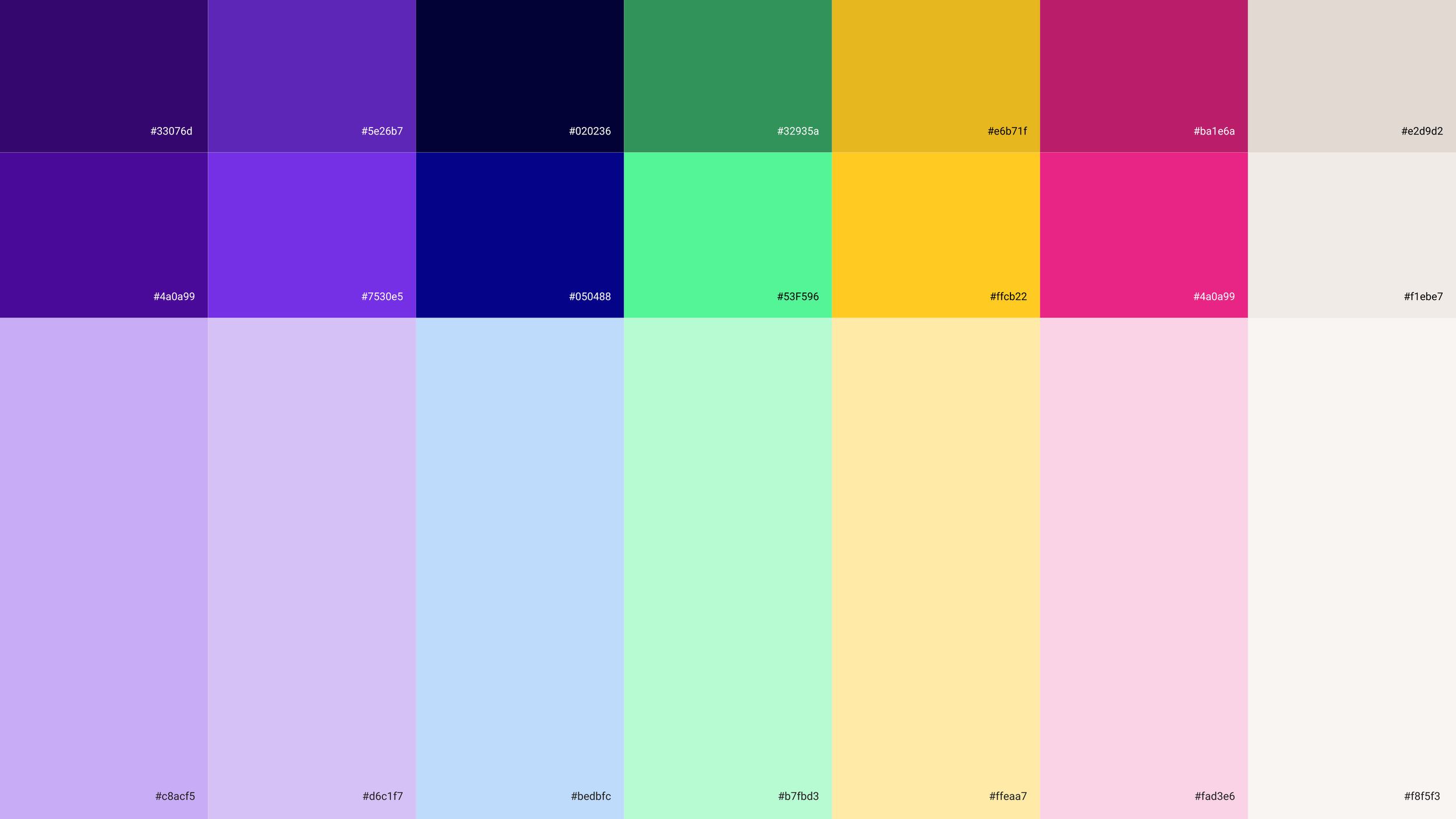
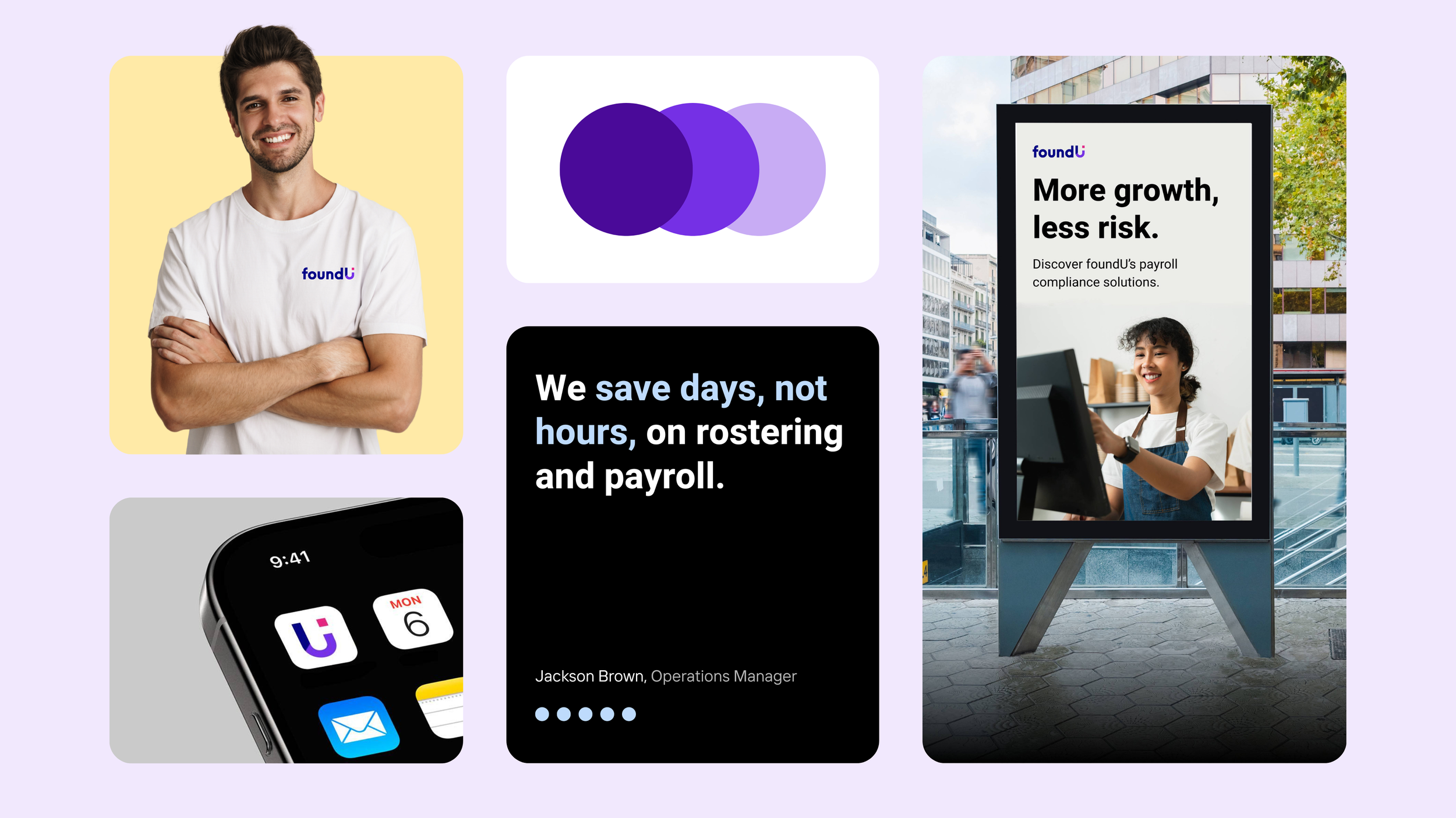
Expanded colour palette
Introduced tints and tones for more flexibility while maintaining brand recognition.
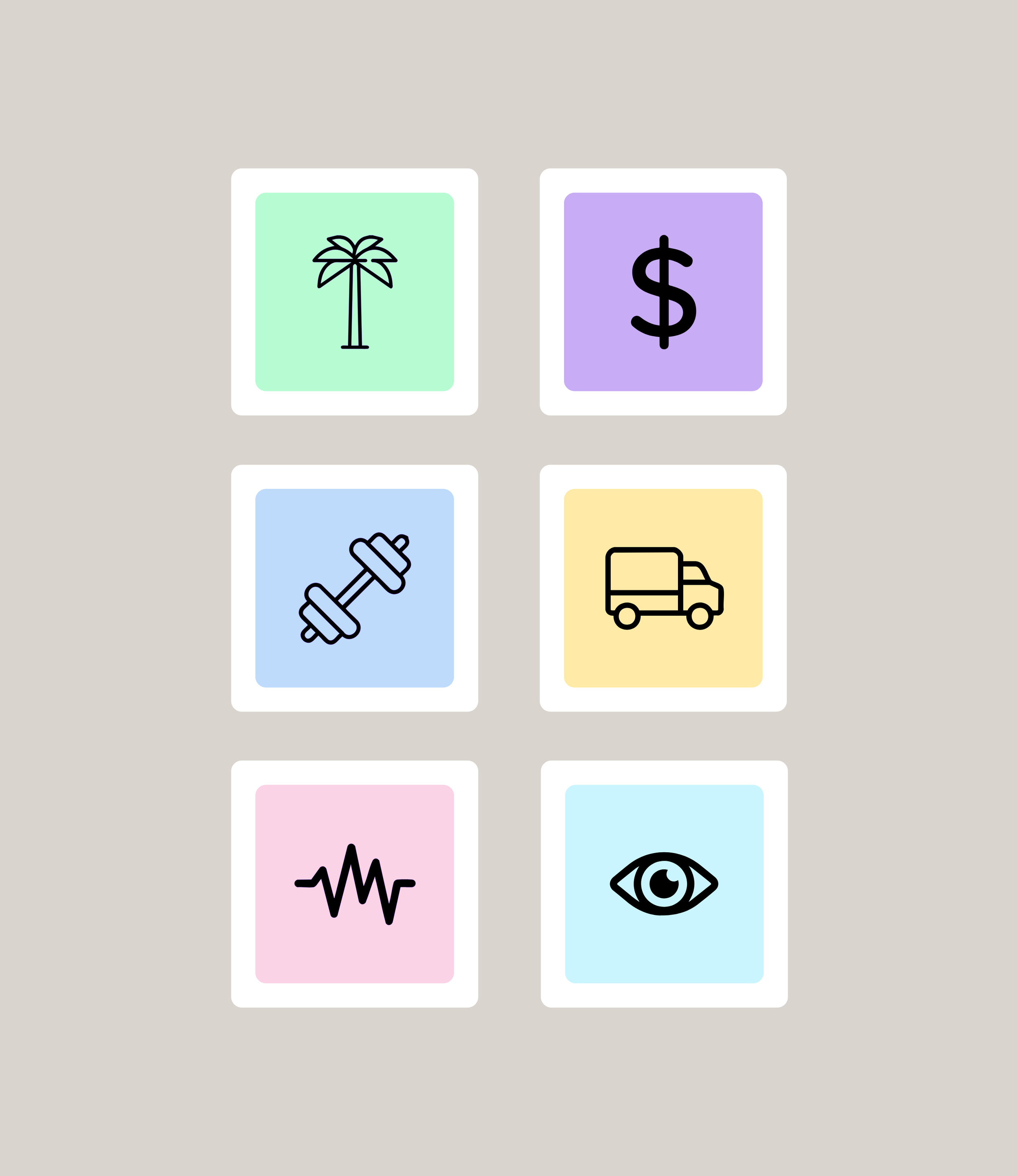
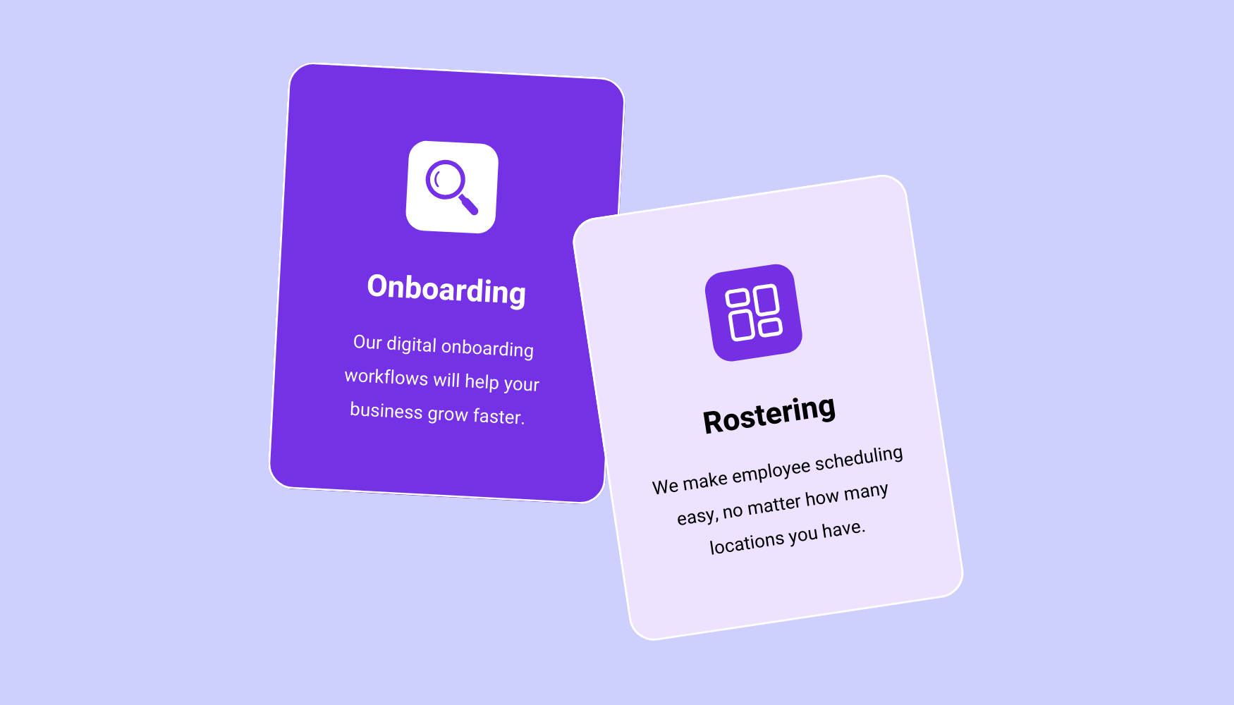
Redesigned icons
Simplified and modernised icons to improve clarity, usability, and personality.
Stylised screenshots & imagery
Replaced cluttered real-time screenshots with clean, stylised visuals and vibrant imagery for a timeless, engaging aesthetic.
Consistency & guidelines
Updated brand guidelines and led team training to ensure the identity was applied consistently across digital and physical assets.
Impact
The refreshed identity strengthened brand cohesion, improved flexibility across touch points, and elevated the overall perception of foundU. Teams can now communicate the brand clearly and consistently, creating a more polished and engaging experience for users and stakeholders alike.
See more work
Empty State Illustrations
Learn more
Website Redesign
Learn more
Adhoc Work
Learn more